3.2 Button、CheckBox与RadioButton
3.2 Button、CheckBox 与 RadioButton
本节摘要:Button 负责触发动作,CheckBox 与 RadioButton 负责表达选择状态;后两者都继承自 CompoundButton,靠 checked 状态与监听器工作。本节给猜数字 App 装上"提交"按钮与"简单/普通/困难"难度选择,顺带讲清 RadioGroup 互斥的原理与按钮外观定制的正规姿势。
从"能输入"到"能提交"
上一节输入框有了,但用户的猜测还躺在 EditText 里。界面的下一个需求很朴素:给一个"提交"按钮。Button 的基本配置几乎是全 Android 最短的 XML:
<Button android:id="@+id/btn_guess" android:layout_width="match_parent" android:layout_height="wrap_content" android:text="@string/btn_guess" android:layout_marginTop="12dp" />
真正值得花时间的是代码侧的接线。Android 的事件监听机制第 5 章会系统讲,这里先记住最常用的 lambda 写法:
binding.btnGuess.setOnClickListener { val guess = binding.etGuess.text.toString().toIntOrNull() when (guess) { null -> Toast.makeText(this, "请输入有效数字", Toast.LENGTH_SHORT).show() else -> doGuess(guess) } }
有一个老坑要提前排掉:不要在 XML 里用 android:onClick 硬编码方法名。那是十年前教程的写子,方法名写错要到运行时点按钮才崩溃,而且方法必须恰好是 public 且带一个 View 参数,重构改名为时已晚。lambda 监听在编译期就能查出一半问题。
选择类控件:CheckBox 与 RadioButton
猜数字 App 想加难度选择:简单模式 20 以内、普通 100 以内、困难允许猜的次数减半。这是典型的"三选一互斥"场景,RadioGroup 加 RadioButton 正为此而生:
<RadioGroup android:id="@+id/rg_difficulty" android:layout_width="match_parent" android:layout_height="wrap_content" android:orientation="horizontal"> <RadioButton android:id="@+id/rb_easy" android:layout_width="wrap_content" android:layout_height="wrap_content" android:text="简单" /> <RadioButton android:id="@+id/rb_normal" android:layout_width="wrap_content" android:layout_height="wrap_content" android:checked="true" android:text="普通" /> <RadioButton android:id="@+id/rb_hard" android:layout_width="wrap_content" android:layout_height="wrap_content" android:text="困难" /> </RadioGroup>
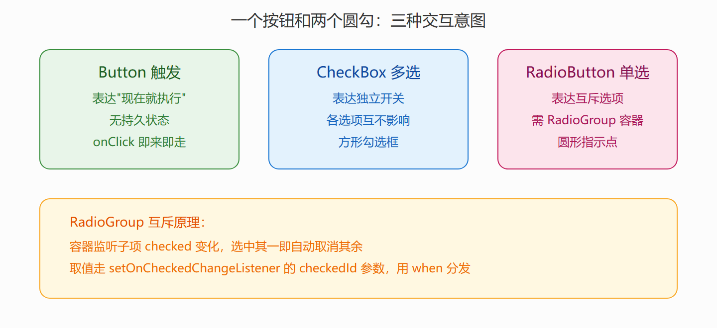
互斥的秘密全在 RadioGroup 这个容器里:它监听子 RadioButton 的选中变化,选中任何一个就自动取消其余的选中——你不需要写一行同步代码。换成三个 CheckBox 就没有这层保护,得自己在监听器里互斥,平白多出一段易漏的状态管理。反过来说,要"多选"时别用多个 RadioButton:比如"开启震动反馈、记住战绩"两个独立开关,就该用 CheckBox:
binding.cbVibrate.setOnCheckedChangeListener { _, isChecked -> settings.vibrate = isChecked } binding.rgDifficulty.setOnCheckedChangeListener { _, checkedId -> when (checkedId) { R.id.rb_easy -> game.range = 20 R.id.rb_hard -> game.maxTries = 5 else -> game.range = 100 } }
图:触发类与选择类控件的分野
⚠️ 常见坑:RadioButton 的
android:checked="true"写在 XML 里只是初始状态;如果逻辑上"默认难度"会随上次退出记住,就该在 onCreate 里用代码binding.rbHard.isChecked = settings.hard设置,别让 XML 与持久化状态打架。
让按钮不像系统默认款
Material 主题下 Button 默认是大写字母加主题色底。要让它贴合设计稿,正规姿势不是乱改背景色,而是走 MaterialButton 的属性体系,或用 ShapeAppearance 定制圆角:
<Button android:id="@+id/btn_guess" android:layout_width="match_parent" android:layout_height="56dp" android:text="提交猜测" android:textSize="16sp" app:cornerRadius="28dp" app:backgroundTint="@color/primary" app:icon="@drawable/ic_send" app:iconGravity="textStart" />
app:cornerRadius 一行就能把直角按钮变成胶囊形,不需要手写 drawable。想加"按下变深"的效果,用 ColorStateList 而不是在监听器里手动换色——状态交给系统描述,代码只管逻辑。
本节要点回顾
- Button 表达动作、CompoundButton 表达状态:选控件先问"这是触发还是选择",再问"单选还是多选"。
- 互斥单选交给 RadioGroup:容器自动同步,监听器拿 checkedId 用 when 分发。
- 别用 android:onClick:lambda 监听编译期更安全,也方便第 5 章统一讲事件机制。
- 外观定制走属性体系:cornerRadius、backgroundTint、ShapeAppearance 比手改背景正规得多。