4.1 LinearLayout线性排列与权重
4.1 LinearLayout 线性排列与权重
本节摘要:LinearLayout 让子控件沿一个方向依次排列,orientation 决定方向,layout_weight 决定剩余空间的瓜分比例。本节把猜数字 App 的控件竖着排整齐,重点拆解权重与 0dp 的经典配合,以及 weightSum、divider 与嵌套的边界。
最快见效的容器
界面上控件堆成一团,最快的整理术就是 LinearLayout:声明方向,子控件自动排队。猜数字主界面先这么搭:
<LinearLayout android:layout_width="match_parent" android:layout_height="match_parent" android:orientation="vertical" android:padding="16dp"> <TextView android:id="@+id/tv_title" android:layout_width="wrap_content" android:layout_height="wrap_content" android:text="猜数字" /> <EditText android:id="@+id/et_guess" android:layout_width="match_parent" android:layout_height="wrap_content" android:inputType="number" /> <Button android:id="@+id/btn_guess" android:layout_width="match_parent" android:layout_height="wrap_content" android:text="提交" /> </LinearLayout>
orientation="vertical" 竖排、horizontal 横排,默认是横向。竖排时每个子控件的 layout_width 才是自由维度,match_parent 表示"和容器一样宽"。想居中标题,用 android:layout_gravity="center_horizontal"——注意这是 1.3 节埋过的记号:gravity 管内容在控件内部,layout_gravity 管控件自己在父容器里。
权重:把剩余空间切成蛋糕
线性排到一半就会遇到硬需求:输入框和"清空"按钮并排,输入框占七成、按钮占三成。固定 dp 在不同屏宽上必然失衡,正确答案是 layout_weight:
<LinearLayout android:layout_width="match_parent" android:layout_height="wrap_content" android:orientation="horizontal"> <EditText android:id="@+id/et_guess" android:layout_width="0dp" android:layout_height="wrap_content" android:layout_weight="7" /> <Button android:id="@+id/btn_clear" android:layout_width="0dp" android:layout_height="wrap_content" android:layout_weight="3" android:text="清空" /> </LinearLayout>
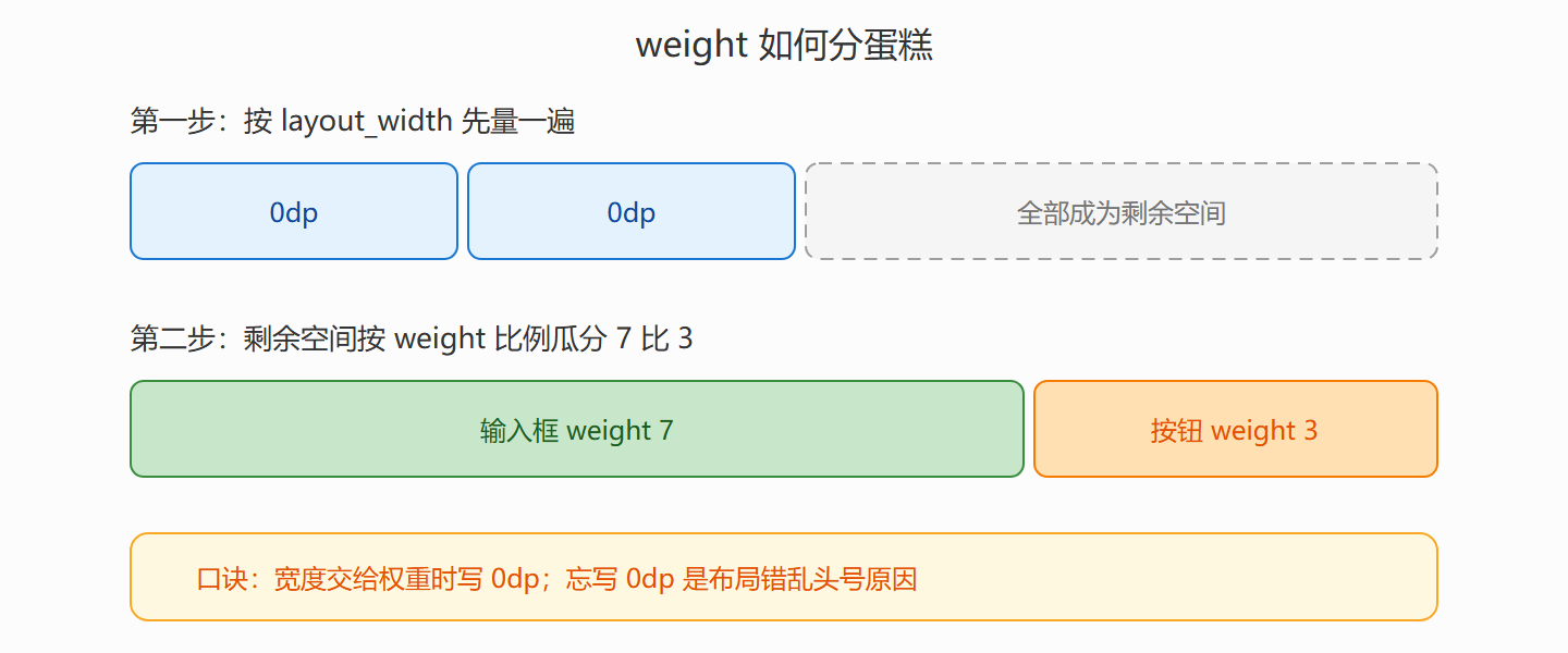
权重的工作机制分两步走:LinearLayout 先按每个子控件的 layout_width 分配一次空间,再把剩余空间按 weight 比例瓜分。当 width 写成 0dp,第一步分到零,最终宽度完全由权重决定——这就是 0dp 加 weight 这一经典组合的原理。忘了写 0dp 时,控件先占住自己的测量宽度,再按比例分剩的,结果是"既不像固定也不像比例"的诡异布局,属于新手答疑榜常年第一名。
weightSum 用来声明总份额,方便留白:
<LinearLayout android:orientation="horizontal" android:weightSum="10" ...> <Button android:layout_width="0dp" android:layout_weight="4" android:text="提示"/> <!-- 剩下 6 份空着,按钮永远占四成宽 --> </LinearLayout>
图:权重瓜分剩余空间的两步机制
嵌套的边界与分隔线
竖排里嵌一行横排是合法且常见的操作,但要有层级预算:嵌套三层 LinearLayout 就该警惕。每层嵌套都是一次额外的测量传递,层级越深 onMeasure 调用次数呈指数放大,列表页上几十个条目乘起来就是掉帧。更深的问题是可读性——三层嵌套的 XML 里找一个控件的位置像走迷宫,这正是 4.3 节 ConstraintLayout 要根治的病。
两个小而实用的技巧收尾。其一是子控件间加分隔线,不必逐个加 margin,容器自带开关:
<LinearLayout android:orientation="vertical" android:divider="@drawable/line_light" android:showDividers="middle" ... />
其二是 android:baselineAligned="false":横排里混着 EditText 与 Button 时,默认按文字基线对齐会导致高度参差,关掉基线对齐改按顶部对齐,两控件立刻齐整。
本节要点回顾
- 方向一个属性:orientation 管 vertical/horizontal,默认横向,写明比靠默认好。
- 0dp 加 weight:把宽度完全交给权重比例,忘写 0dp 是布局错乱第一因。
- weightSum 留白:声明总份额,让某控件固定占比而不是吃掉全部剩余。
- 嵌套三层即警觉:测量成本与可读性双输,复杂关系交给 4.3 节的约束。
- gravity 与 layout_gravity:一个管内容、一个管自己,本节用 layout_gravity 居中了标题。