4.3 ConstraintLayout约束思维
4.3 ConstraintLayout 约束思维
本节摘要:ConstraintLayout 不再回答"控件排在哪",而是回答"控件被什么拉住"——四边约束定位置、偏置定比例、链条处理群体、屏障对齐动态边界。本节把猜数字 App 主界面重写成一份扁平的约束布局,并解释 0dp 的另一种含义与布局编辑器的正确用法。
从"位置"到"约束"的换脑
前两节的容器都在描述摆放结果,ConstraintLayout 描述的是受力关系。一个控件的水平位置由左右两条约束拉住,垂直位置由上下两条约束拉住;只拉一边,它就贴那边;两边都拉而尺寸是 wrap_content,它居中。猜数字主界面的约束版本:
<androidx.constraintlayout.widget.ConstraintLayout android:layout_width="match_parent" android:layout_height="match_parent"> <TextView android:id="@+id/tv_title" android:layout_width="wrap_content" android:layout_height="wrap_content" app:layout_constraintTop_toTopOf="parent" app:layout_constraintStart_toStartOf="parent" app:layout_constraintEnd_toEndOf="parent" android:layout_marginTop="24dp" android:text="猜数字" /> <EditText android:id="@+id/et_guess" android:layout_width="0dp" android:layout_height="wrap_content" app:layout_constraintTop_toBottomOf="@id/tv_title" app:layout_constraintStart_toStartOf="parent" app:layout_constraintEnd_toStartOf="@id/btn_guess" android:layout_marginTop="16dp" android:inputType="number" /> <Button android:id="@+id/btn_guess" android:layout_width="wrap_content" android:layout_height="wrap_content" app:layout_constraintTop_toTopOf="@id/et_guess" app:layout_constraintEnd_toEndOf="parent" android:text="提交" /> </androidx.constraintlayout.widget.ConstraintLayout>
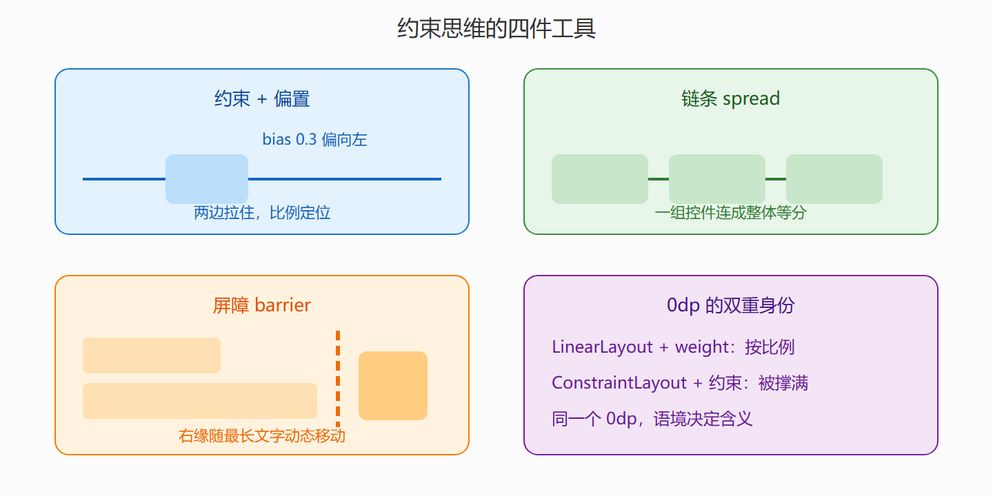
注意 0dp 在这里的身份变了:约束布局里 0dp 表示 match constraint——宽度和约束边界一样宽。输入框左右被两条约束拉住、宽度 0dp,于是它自动填满标题到按钮之间的全部空间,按钮宽度不变。同一个 0dp,在 LinearLayout 里配合 weight 是"按比例",在 ConstraintLayout 里是"被约束撑满",语境不同身份不同。
偏置、链条与屏障
**偏置(bias)**解决"两边都拉但不居中":默认 0.5 是居中,改成 0.3 控件偏向起点三成。想在屏幕三分之一处放装饰元素,两条约束加一个 bias 就够:
app:layout_constraintHorizontal_bias="0.3"
**链条(chain)**把一组同方向控件连成整体并规定分配方式。三个难度按钮等宽铺满一行,就是 spread 链条:给三个按钮两两建立横向约束、头尾拉到父容器,再在链条头设置:
<RadioButton ... app:layout_constraintHorizontal_chainStyle="spread" app:layout_constraintHorizontal_weight="1" />
**屏障(barrier)**像一条虚拟的橡皮筋,位置由一组控件的真实边界动态决定。经典场景:右侧一列文字可能一行也可能两行,左侧的图无论如何要与"最长那行"对齐——给文字们立一道右边界屏障,图约束到屏障即可,文字换行图自动跟:
<androidx.constraintlayout.widget.Barrier android:id="@+id/bar_text_right" android:layout_width="wrap_content" android:layout_height="wrap_content" app:barrierDirection="end" app:constraint_referenced_ids="tv_result,tv_hint" />
图:约束、偏置、链条、屏障四种受力
编辑器与扁平化的价值
约束写起来啰嗦,Android Studio 的布局编辑器正是为此而生。正确用法是"拖控件到设计稿位置,编辑器生成约束,再回到 XML 微调数值"——纯手写与纯拖拽都是苦路。编辑器里蓝色实心圆点表示已生效约束,波浪线橙点表示缺失约束(运行时控件会跳到 0,0),黄色警告通常是尺寸问题,学会看这三色灯比背属性更重要。
ConstraintLayout 的终极卖点是扁平:一段三层嵌套的 LinearLayout,重写成约束后通常只剩一层。层级浅一寸,测量快一分,XML 短一截。判断"该不该重写"的经验法则:嵌套超过两层、或出现"用空 ViewGroup 只为占位"的坏味道,就值得动刀。
本节要点回顾
- 约束是受力描述:水平垂直各两条,只拉一边贴一边,两边拉住居中,bias 调比例。
- 0dp 双重身份:配 weight 是比例,配约束是撑满,别混语境。
- 链条管群体、屏障管动态边界:等分一行用 chain,对齐可变内容用 barrier。
- 编辑器三色灯:蓝已约束、橙缺失、黄尺寸,比死记属性更可靠。
- 扁平是目标:两层以上嵌套或空占位容器,就该考虑重写成约束。