页面加载动画实战:让首屏元素优雅地进入视野
页面加载动画实战:让首屏元素优雅地进入视野
最基础的形式:直接写 class
最简单的页面加载动画,就是在 HTML 元素上直接写 Animate.css 的类名。页面加载完成后,浏览器自动播放动画。
<!DOCTYPE html> <html lang="zh-CN"> <head> <meta charset="UTF-8"> <title>页面加载动画</title> <link rel="stylesheet" href="https://cdnjs.cloudflare.com/ajax/libs/animate.css/4.1.1/animate.min.css"> </head> <body> <header class="animate__animated animate__fadeInDown"> <h1>网站标题</h1> </header> <main> <section class="animate__animated animate__fadeInUp animate__delay-1s"> <h2>主要内容</h2> <p>这是一段内容描述文字。</p> </section> <section class="animate__animated animate__fadeInUp animate__delay-2s"> <h2>次要内容</h2> <p>更多描述文字。</p> </section> </main> <footer class="animate__animated animate__fadeIn animate__delay-3s"> <p>版权信息</p> </footer> </body> </html>
标题从上方淡入,两个内容区依次从下方淡入,底部最后淡入。用延迟类 animate__delay-1s 到 animate__delay-3s 控制出场顺序。
初始状态隐藏的坑
上面的代码有一个问题:在动画开始前的延迟期间,元素是可见的(opacity: 1)。只有动画播放后,@keyframes 的 from 帧(opacity: 0)才生效。但由于 animation-fill-mode: both(animate__animated 默认值),元素在延迟期间应该保持 from 帧的状态。
测试一下:fadeInUp 的 from 帧是 opacity: 0; transform: translate3d(0, 100%, 0);。配合 animation-fill-mode: both,元素在延迟期间确实会是 opacity: 0——用户看不到它。动画结束后保持 to 帧(opacity: 1; transform: none;)。
但如果你直接写 class="animate__animated animate__fadeInUp",在 CSS 文件加载完成之前(比如网络慢),元素会是可见的默认状态。解决方案是给元素一个初始隐藏:
/* 安全的初始隐藏 */ .will-animate { opacity: 0; } /* Animate.css 动画开始后自动覆盖 opacity */
但注意:如果用户禁用了 JavaScript(非必需,但考虑极端情况),元素会永远不可见。更好的方案是配合 noscript 回退:
<style>.will-animate { opacity: 0; }</style> <noscript><style>.will-animate { opacity: 1; }</style></noscript>
首屏交错动画实战
一个常见的落地页效果:Hero 区域的标题、副标题、CTA 按钮依次从下方进入,间距 200ms。
<style> .hero { text-align: center; padding: 120px 20px; } .hero h1 { font-size: 48px; margin-bottom: 16px; } .hero p { font-size: 20px; color: #666; margin-bottom: 32px; } .hero .cta { display: inline-block; padding: 12px 32px; background: #4361ee; color: white; border-radius: 8px; text-decoration: none; } /* 交错延迟:200ms 递增 */ .hero h1 { --animate-delay: 0.2s; } .hero p { --animate-delay: 0.4s; } .hero .cta { --animate-delay: 0.6s; } </style> <section class="hero"> <h1 class="animate__animated animate__fadeInUp">产品名称</h1> <p class="animate__animated animate__fadeInUp">一句话产品介绍,直击核心价值</p> <a class="cta animate__animated animate__fadeInUp" href="#">立即开始</a> </section>
CSS 变量比延迟类更灵活——延迟类只提供整秒选项,CSS 变量可以设置任意值。
列表卡片交错动画
页面下方的特性列表或卡片区域,需要每个卡片依次进入。如果卡片数量固定,直接写延迟:
<div class="features-grid"> <div class="card animate__animated animate__fadeInUp" style="--animate-delay: 0.1s">特性1</div> <div class="card animate__animated animate__fadeInUp" style="--animate-delay: 0.2s">特性2</div> <div class="card animate__animated animate__fadeInUp" style="--animate-delay: 0.3s">特性3</div> <div class="card animate__animated animate__fadeInUp" style="--animate-delay: 0.4s">特性4</div> <div class="card animate__animated animate__fadeInUp" style="--animate-delay: 0.5s">特性5</div> <div class="card animate__animated animate__fadeInUp" style="--animate-delay: 0.6s">特性6</div> </div>
对于动态生成的列表,用 CSS nth-child 或 JS 生成内联样式:
/* CSS 方案:适合固定数量 */ .card:nth-child(1) { --animate-delay: 0.1s; } .card:nth-child(2) { --animate-delay: 0.2s; } .card:nth-child(3) { --animate-delay: 0.3s; } /* ... */ /* 通用公式方案(CSS 自定义属性 + calc) */ .features-grid .card { --animate-delay: calc(var(--index, 0) * 0.1s); }
CSS 的 calc() 不支持用 nth-child() 作为变量进行计算。通用公式的 CSS 写法有一定局限。对于动态列表,JS 方案更灵活:
document.querySelectorAll('.card').forEach(function(card, index) { card.style.setProperty('--animate-delay', (index * 0.1) + 's'); });
延迟触发 vs 滚动触发
页面加载动画(页面打开就播放)和滚动触发动画(元素进入视口时播放)是两种不同策略。
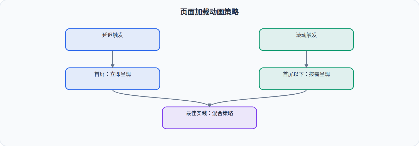
延迟触发适合首屏内容——用户打开页面的前 2-3 秒是黄金注意力窗口,在这段时间内让核心内容动画入场效果最好。
滚动触发适合长页面——用户向下滚动时,新的内容区域在进入视口时播放动画。如果所有内容在页面加载时就开始动画,用户可能看不到首屏以下的内容入场。
滚动触发的基本实现
用 IntersectionObserver 监听元素进入视口,然后添加 Animate.css 类:
// 创建一个全局 Observer var observer = new IntersectionObserver(function(entries) { entries.forEach(function(entry) { if (entry.isIntersecting) { // 元素进入视口,添加动画类 entry.target.classList.add('animate__animated', 'animate__fadeInUp'); // 动画播放后取消监听(不需要重复触发) observer.unobserve(entry.target); } }); }, { threshold: 0.1 // 元素 10% 可见时触发 }); // 对所有需要动画的元素注册监听 document.querySelectorAll('.scroll-animate').forEach(function(el) { el.classList.add('opacity-0'); // 初始隐藏 observer.observe(el); });
.opacity-0 { opacity: 0; }
这种方式有几个注意点:
- 元素需要初始隐藏(
.opacity-0),否则在 Observer 触发前元素可见 observer.unobserve()在首次触发后取消监听,避免重复动画threshold: 0.1控制触发时机——元素露出 10% 就触发,可以改为 0.2 或 0.3
首屏动画的性能考量
页面加载时如果同时触发太多动画,可能导致以下问题:
合成层过多。每个带 transform 动画的元素都会创建独立的合成层。如果首屏有 30 个元素同时在动画,GPU 可能吃不消。控制同时动画的元素数量——首屏建议不超过 5-8 个。
CLS(Cumulative Layout Shift)。如果动画元素位移较大(如 fadeInUp 从 100% 位移到 0),周围元素的位置可能在动画过程中变化,导致布局偏移。给动画元素的容器设置固定高度可以避免:
.card-container { min-height: 200px; /* 防止动画期间 CLS */ }
资源加载竞争。页面加载时,浏览器同时加载 CSS、JS、图片、字体。动画在 CSS 加载完成后才能播放,如果 Animate.css 加载慢,动画会延迟出现。建议把 Animate.css 放在 <head> 顶部(或用 <link rel="preload"> 预加载),确保它尽早可用。
完整实战:落地页动画方案
一个完整的落地页动画方案,混合延迟触发和滚动触发:
<!DOCTYPE html> <html lang="zh-CN"> <head> <meta charset="UTF-8"> <link rel="stylesheet" href="animate.min.css"> <style> /* 首屏交错延迟 */ .hero h1 { --animate-delay: 0.2s; --animate-duration: 1s; } .hero p { --animate-delay: 0.4s; --animate-duration: 1s; } .hero .btn { --animate-delay: 0.6s; --animate-duration: 0.8s; } /* 滚动动画初始状态 */ .reveal { opacity: 0; transform: translateY(30px); transition: all 0.6s ease-out; } .reveal.visible { opacity: 1; transform: translateY(0); } </style> </head> <body> <!-- 首屏:延迟触发 --> <section class="hero"> <h1 class="animate__animated animate__fadeInUp">标题</h1> <p class="animate__animated animate__fadeInUp">副标题</p> <a class="btn animate__animated animate__fadeInUp">按钮</a> </section> <!-- 下方:滚动触发 --> <section class="features"> <h2 class="reveal">特性标题</h2> <div class="card reveal">卡片1</div> <div class="card reveal">卡片2</div> <div class="card reveal">卡片3</div> </section> <script> var revealObserver = new IntersectionObserver(function(entries) { entries.forEach(function(entry) { if (entry.isIntersecting) { entry.target.classList.add('visible'); revealObserver.unobserve(entry.target); } }); }, { threshold: 0.15 }); document.querySelectorAll('.reveal').forEach(function(el) { revealObserver.observe(el); }); </script> </body> </html>
首屏用 Animate.css 的 fadeInUp + CSS 变量延迟,首屏以下用原生 transition + IntersectionObserver。两种方案混合使用的原因是:Animate.css 的动画是一次性的(播放就结束),滚动触发更适合用 transition(切换 CSS 类就能反复触发)。
当然,你也可以在滚动触发时使用 Animate.css 的动画类——但需要处理"重新播放"的逻辑(移除类 → 触发重排 → 重新添加类),复杂度更高。选择哪种方案取决于你的具体需求。