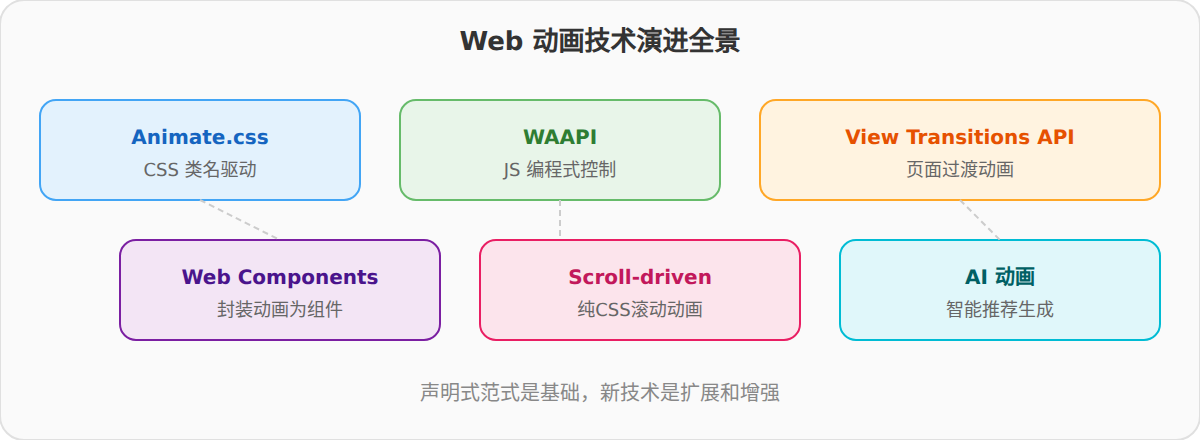
动画的未来:WAAPI、WebComponents与AI驱动的新范式
动画的未来:WAAPI、Web Components与AI驱动的新范式
Web Animations API(WAAPI)
WAAPI 是浏览器原生提供的 JavaScript 动画 API,是 CSS Animation 和 JS 动画之间的"缺失环节"。
// WAAPI 基础用法 var element = document.querySelector('.box'); var animation = element.animate([ { opacity: 0, transform: 'translate3d(0, 100%, 0)' }, { opacity: 1, transform: 'translate3d(0, 0, 0)' } ], { duration: 1000, easing: 'ease-out', fill: 'both' });
WAAPI 的优势:
- 可编程控制:暂停、恢复、反向、跳转到指定时间点、调整播放速率。
- 与 CSS Animation 共享渲染管线:底层走的是同一条 GPU 加速路径。
- 事件模型更完善:Promise 化的
finished、cancel()、updatePlaybackRate()。
// WAAPI 的高级控制 animation.pause(); // 暂停 animation.currentTime = 500; // 跳到 500ms animation.playbackRate = 2; // 2 倍速 animation.reverse(); // 反向播放 animation.finished.then(function() { console.log('动画完成'); });
WAAPI 与 Animate.css 的互补关系
WAAPI 可以直接使用 CSS 中定义的 @keyframes:
// 使用 Animate.css 定义的关键帧 var animation = element.animate( // 引用 CSS @keyframes [ { opacity: 0, transform: 'translate3d(0, 100%, 0)' }, { opacity: 1, transform: 'translate3d(0, 0, 0)' } ], { duration: 1000, easing: 'ease-out' } );
这意味着你可以用 Animate.css 的 @keyframes 定义动画形状,用 WAAPI 控制播放时序。这是目前最实用的混合方案之一。
未来可能的 API:
// 假设:直接使用 CSS 类名对应的 keyframes var animation = element.animate('fadeInUp', { duration: 1000, delay: 200 });
浏览器厂商已经有相关提案,但尚未标准化。
Web Components
Web Components 让动画成为组件的内在属性:
<template id="animated-card-template"> <style> :host { display: block; } .content { animation: var(--animation-name) var(--animation-duration) var(--animation-timing) both; animation-delay: var(--animation-delay, 0s); } </style> <div class="content"> <slot></slot> </div> </template> <script> class AnimatedCard extends HTMLElement { constructor() { super(); this.attachShadow({ mode: 'open' }); this.shadowRoot.appendChild( document.getElementById('animated-card-template').content.cloneNode(true) ); } static get observedAttributes() { return ['animation', 'duration', 'delay']; } attributeChangedCallback(name, oldVal, newVal) { if (name === 'animation') { this.style.setProperty('--animation-name', newVal); } else if (name === 'duration') { this.style.setProperty('--animation-duration', newVal); } else if (name === 'delay') { this.style.setProperty('--animation-delay', newVal); } } // 暴露 play/pause 方法 play() { var content = this.shadowRoot.querySelector('.content'); content.style.animationPlayState = 'running'; } pause() { var content = this.shadowRoot.querySelector('.content'); content.style.animationPlayState = 'paused'; } } customElements.define('animated-card', AnimatedCard); </script>
使用:
<link rel="stylesheet" href="animate.css"> <animated-card animation="fadeInUp" duration="1s" delay="0.2s"> 卡片内容 </animated-card>
@keyframes 定义仍然来自 Animate.css 的 CSS 文件,Web Component 只是通过 CSS 变量引用它。动画逻辑完全封装在 Shadow DOM 内,不污染外部。
CSS View Transitions API
一个正在快速标准化的新 API——页面过渡动画:
// 页面路由切换时的过渡动画 document.startViewTransition(function() { updateDOM(); // 更新页面内容 });
配合 CSS:
::view-transition-old(root) { animation: fadeOut 0.3s ease-in; } ::view-transition-new(root) { animation: fadeIn 0.3s ease-out; }
这个 API 与 Animate.css 的关系:View Transitions 的 @keyframes 可以直接使用 Animate.css 中定义的动画名称(前提是 Animate.css 已引入)。这意味着页面切换动画可以复用 Animate.css 的动画库。
AI 驱动的动画
动画推荐
未来的工具可能根据页面内容和布局自动推荐动画:
// 假设的 AI 动画推荐 API const recommendations = await AI.suggestAnimations({ context: 'landing page hero', elements: ['title', 'subtitle', 'cta-button', 'hero-image'], brand: 'professional', constraints: { maxDuration: '1.2s', reducedMotion: false } }); // 返回: { title: 'fadeInDown', subtitle: 'fadeInUp', cta: 'zoomIn', image: 'slideInLeft' }
缓动曲线生成
AI 可以根据"用户期望的运动感觉"生成缓动曲线:
用户输入: "我想要一个有弹性的进入效果" AI 输出: cubic-bezier(0.34, 1.56, 0.64, 1)
这本质上是将设计术语映射到数学参数。目前 Framer Motion 等工具已经提供了弹簧参数(stiffness、damping、mass),AI 可以根据"希望的感觉"自动调参。
关键帧自动生成
给定起始和终止状态,AI 生成中间关键帧:
起始: opacity: 0, scale: 0.5 终止: opacity: 1, scale: 1 AI 生成的中间帧: 40%: opacity: 0.6, scale: 1.08 70%: opacity: 1, scale: 0.95 85%: opacity: 1, scale: 1.02
这些中间帧模拟了物理弹簧的过冲-回弹行为。
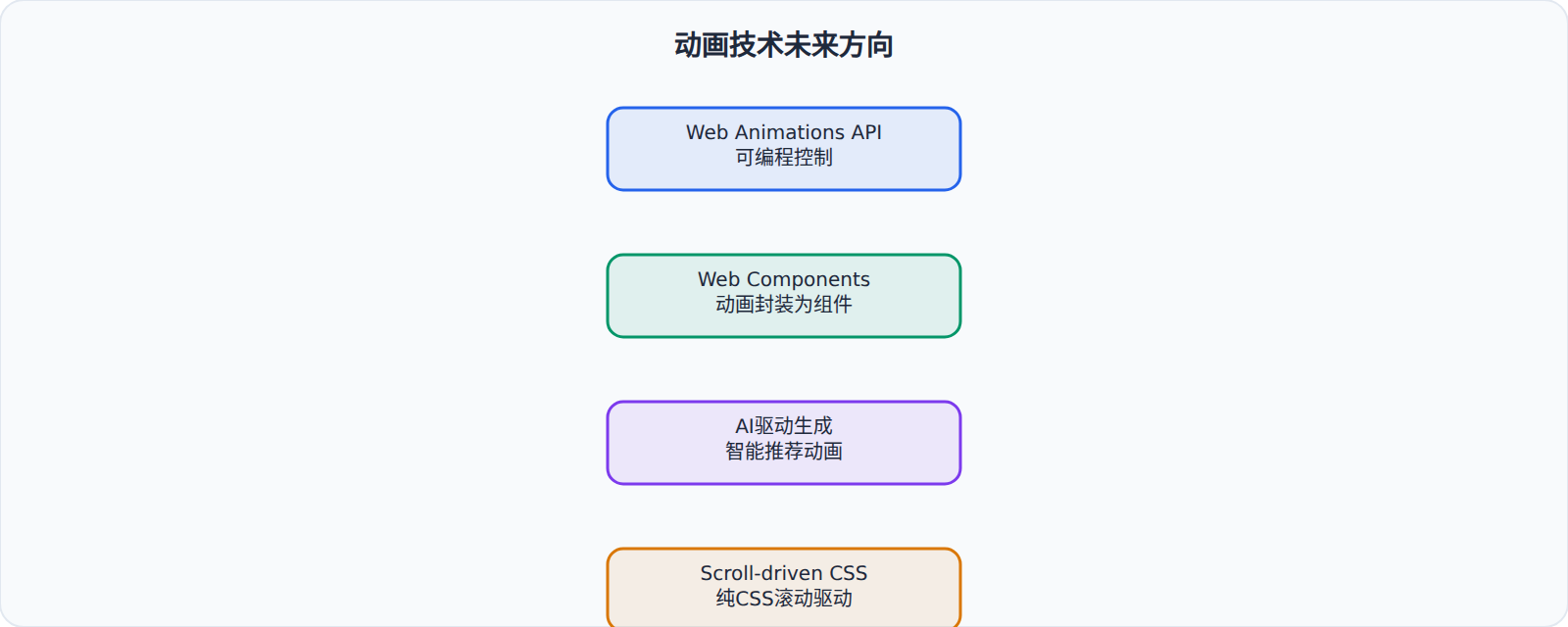
Animate.css 的可能演进方向
给开发者的建议
-
不要等新技术。WAAPI、Scroll-driven Animations、View Transitions 都值得学习,但目前兼容性不足以作为生产环境的唯一方案。Animate.css + IntersectionObserver 的组合仍然是最稳妥的选择。
-
关注 WAAPI 的.finished Promise。这是当前 WAAPI 最实用的特性——把动画结束变成 Promise,简化 JS 动画链的编写。
-
开始尝试 View Transitions API。Chrome 已支持,可以用于 SPA 的路由切换动画。
-
保持对 AI 工具的关注但不过度依赖。AI 生成的动画参数可以作为起点,但最终调优仍需要人的判断。
-
Animate.css 的核心价值不会过时。无论底层技术如何演进,"预定义动画 → 类名触发"的声明式范式始终有它的价值。新技术的出现更多是补充而非替代。