WTFCSS极简教程19.BAYC页面
WTF CSS极简教程: 19. BAYC页面
WTF CSS教程,总结/搬运自MDN CSS教程,帮助新人快速入门CSS。
推特:@WTFAcademy_ | @0xAA_Science
WTF Academy社群: 官网 wtf.academy | WTF Solidity教程 | discord | 微信群申请
所有代码和教程开源在github: github.com/WTFAcademy/WTF-CSS
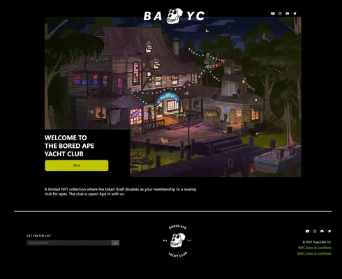
这一讲,我们将使用预处理器less编写一个极简BAYC mint页面样式表,制作所需要的HTML和img文件已经准备好了。最终效果如下:
通用样式设置
BAYC官网的背景是黑色的,所有的字体都是白色的,因此我们可以通过通用样式去调整。
body { background-color: black; } * { color: white; }
右下角这部分的内容都靠右,我们可以设置一个right类的通用样式,然后在需要的元素上添加即可。
.right { display: flex; justify-content: flex-end; }
class="header"
然后我们处理头部的样式,BAYC官网头部的样式是这样的:

头部的内容比较少,我们可以用定位来解决,方法与上一讲UniswapHTML&CSS类似,这里就不再赘述。不要忘记修改bayc-logo的z-index>=1,这样才能让它处于video的上方。
.header { &>img { position: relative; left: 50%; margin-left: -150px; padding-top: 24px; margin-bottom: -40px; width: 300px; z-index: 1; } & a { text-decoration: none; &>img { margin-left: 10px; height: 16px; } } &>.socialMedia { position: absolute; top: 50px; right: 50%; margin-right: -550px; } }
class="body"
然后我们处理中间内容的样式。
首先是面积最大的welcome部分,我们通过调整它的width、position、left、margin-left让它水平居中。
.body { &>.welcome { width: 1140px; position: relative; left: 50%; margin-left: -570px; } }
子元素video的宽度调整为100%使其撑满父元素。
& video { width: 100%; }
子元素mint的position调整为absolute就可以让它覆盖在video的上方,然后再调整它的bottom属性使其位于video的左下角。
&>.mint { background-color: black; position: absolute; bottom: 0px; width: 380px; height: 215px; }
mint里的欢迎词样式比较简单,它之所以排了三行是因为它的HTML里有两个<br/>。
&>h1 { width: 285px; height: 98px; font-size: 27px; }
mint按钮鼠标悬浮上去之后会有一个缓慢变色的效果,可以给它加一个transition。
&>button { width: 285px; height: 52px; font-size: 16px; color: black; background-color: #bfc500; border-radius: 10px; &:hover { background-color: white; transition: 0.5s; } }
接着video下面的description用同样的方法使它居中,再调整它的margin-top和margin-bottom让它与上下元素分离。
&>.description { position: relative; left: 50%; margin-left: -570px; width: 700px; height: 48px; margin-top: 40px; margin-bottom: 60px; }
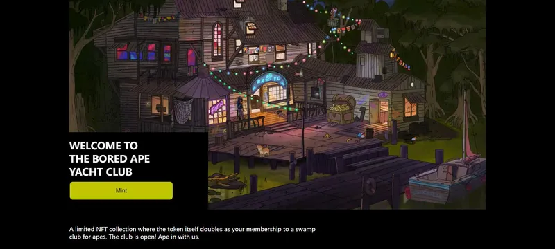
到此body里的关键点就讲完了,效果如下:
class="footer"
最后是尾部的样式。
首先是一个分割线,这里千万不要傻傻地在div中输入一大串的———。我们通过调整它的宽高让整个元素变成一条线,再调整margin为0 auto使其居中,最后让它的background-color为white,就画出了一条分割线。
.footer { &>.line { margin: 0 auto; width: 93%; height: 2px; background-color: white; } }
然后是info中三个子元素的排列。我们让左右元素的宽度相同,再使用flex布局就可以让三个子元素均匀排列在同一水平线上。
&>.info { display: flex; justify-content: space-between; width: 90%; height: 240px; margin: 30px 96px; &>.email { width: 530px; height: 62px; margin: 69px 0; padding: 0 15px; } &>img { width: 200px; height: 200px; } &>.others { width: 560px; height: 184px; padding: 20px 0; } }
之后是email中子元素的样式,这一部分比较简单,其中我们用position、top和left来微调button的位置。
&>.get-on-the-list { font-size: 13px; } &>.getEmail { width: 530px; height: 28px; padding-top: 10px; &>input { width: 376px; height: 24px; padding: 2px 2px 2px 10px; box-sizing: border-box; background-color: #272626; color: white; border: none; } &>button { width: 36px; height: 24px; background-color: #4b4a4a; position: relative; top: 1px; left: -5px; border: none; } }
最后是右下角的样式,这部分也比较简单。其中socialMedia的样式与前面是一样的,可以直接复制粘贴过来,也可以两处都不写而是在样式表最前面单独给它写一个样式。
& .socialMedia { margin: 28px 0; &>a { text-decoration: none; &>img { margin-left: 10px; height: 16px; } } } & .copyright { height: 24px; font-size: 12px; } &>.a-wrapper { height: 26px; &>a { color: yellowgreen; font-size: 12px; } }
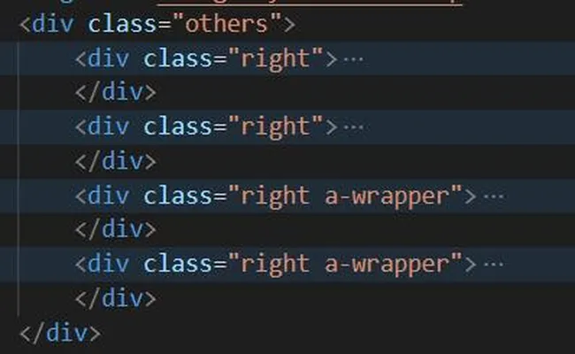
同时我们给other的四个子元素都增加了一个提前写好的right类名,这样它子元素里的内容就会靠右。
至此,BAYC极简页面就完成了,效果如下:
可以看到,我们做的极简页面和官方页面是非常相似的。但目前该页面还没有任何功能,这需要我们后续继续给它加上JS。
总结
这一讲我们用预处理器less编写了一个BAYC极简页面样式表,做出的效果与官方页面十分相似。学员们自己练习时不必写的与本教程一模一样,只要能达到预期效果即可。