时间序列预测与ARIMA
文档摘要
时间序列预测与ARIMA 在上一课中,你已经了解了一些关于时间序列预测的知识,并加载了一个展示一段时间内电力负荷波动的数据集。 ARIMA简介 点击上面的图片观看视频:对ARIMA模型的简要介绍。示例是用R语言完成的,但这些概念是通用的。 课前测验 引言 在这节课中,你将发现一种特定的方式来构建带有 [ARIMA: 自回归整合移动平均] 模型的方法。ARIMA模型特别适合处理表现出 非平稳性 的数据。 基本概念 为了能够使用ARIMA,你需要了解一些概念: 平稳性。从统计学的角度来看,平稳性指的是数据分布不随时间变化的数据。非平稳数据则会因为趋势而显示出波动,必须进行转换才能进行分析。例如,季节性可以引入数据中的波动,可以通过“季节差分”过程来消除。 差分。
时间序列预测与ARIMA
在上一课中,你已经了解了一些关于时间序列预测的知识,并加载了一个展示一段时间内电力负荷波动的数据集。
点击上面的图片观看视频:对ARIMA模型的简要介绍。示例是用R语言完成的,但这些概念是通用的。
课前测验
引言
在这节课中,你将发现一种特定的方式来构建带有 [ARIMA: 自回归整合移动平均] 模型的方法。ARIMA模型特别适合处理表现出 非平稳性 的数据。
基本概念
为了能够使用ARIMA,你需要了解一些概念:
-
平稳性。从统计学的角度来看,平稳性指的是数据分布不随时间变化的数据。非平稳数据则会因为趋势而显示出波动,必须进行转换才能进行分析。例如,季节性可以引入数据中的波动,可以通过“季节差分”过程来消除。
-
差分。同样从统计学的角度来看,差分是指通过去除其非恒定趋势将非平稳数据转换为平稳数据的过程。“差分消除了时间序列的变化,消除了趋势和季节性,从而稳定了时间序列的均值。”Shixiong等人的论文
ARIMA在时间序列中的应用
让我们拆解ARIMA的各个部分,以便更好地理解它如何帮助我们建模时间序列并对其进行预测。
-
AR - 自回归。自回归模型正如其名所示,会“回溯”查看数据中的先前值并对其做出假设。这些先前值被称为“滞后”。例如,数据可能显示铅笔每月销量。每个月的销售总额会被视为数据集中的一个“演变变量”。该模型构建为“感兴趣的演变变量根据其自身的滞后(即,之前的)值进行回归。”维基百科
-
I - 整合。与类似的“ARMA”模型不同,ARIMA中的“I”指其*整合* 特征。当应用差分步骤以消除非平稳性时,数据就被“整合”。
-
MA - 移动平均。此模型的移动平均部分指的是输出变量由观察当前和过去滞后值决定。
总结:ARIMA用于尽可能紧密地拟合时间序列数据的特殊形式。
练习 - 构建ARIMA模型
打开这节课中的/working文件夹,找到notebook.ipynb文件。
-
运行笔记本以加载
statsmodelsPython库;你将需要这个库来构建ARIMA模型。 -
加载必要的库
-
现在,加载更多有用的绘图库:
import os import warnings import matplotlib.pyplot as plt import numpy as np import pandas as pd import datetime as dt import math from pandas.plotting import autocorrelation_plot from statsmodels.tsa.statespace.sarimax import SARIMAX from sklearn.preprocessing import MinMaxScaler from common.utils import load_data, mape from IPython.display import Image %matplotlib inline pd.options.display.float_format = '{:,.2f}'.format np.set_printoptions(precision=2) warnings.filterwarnings("ignore") # specify to ignore warning messages -
将数据从
/data/energy.csv文件加载到Pandas数据框中并查看:energy = load_data('./data')[['load']] energy.head(10) -
绘制2012年1月至2014年12月的所有可用能源数据。由于我们在上一课中已经看到过这些数据,所以不会有惊喜:
energy.plot(y='load', subplots=True, figsize=(15, 8), fontsize=12) plt.xlabel('timestamp', fontsize=12) plt.ylabel('load', fontsize=12) plt.show()现在,让我们构建一个模型!
创建训练和测试数据集
现在你的数据已经加载完毕,你可以将其分为训练集和测试集。你将在训练集上训练模型。如通常所做,在模型训练完成后,你将使用测试集评估其准确性。你需要确保测试集覆盖的时间段晚于训练集的时间段,以确保模型不会从未来的时间段中获取信息。
-
分配一个两个月的时期,从2014年9月1日至2014年10月31日作为训练集。测试集将包括2014年11月1日至2014年12月31日的两个月时间段:
train_start_dt = '2014-11-01 00:00:00' test_start_dt = '2014-12-30 00:00:00'由于这些数据反映了每日的能源消耗,存在很强的季节性模式,但最近几天的消耗是最相似的。
-
可视化差异:
energy[(energy.index < test_start_dt) & (energy.index >= train_start_dt)][['load']].rename(columns={'load':'train'}) \ .join(energy[test_start_dt:][['load']].rename(columns={'load':'test'}), how='outer') \ .plot(y=['train', 'test'], figsize=(15, 8), fontsize=12) plt.xlabel('timestamp', fontsize=12) plt.ylabel('load', fontsize=12) plt.show()
因此,使用相对较短的时间窗口进行训练应该是足够的。
注意:由于我们用来拟合ARIMA模型的函数在拟合过程中使用了样本内验证,我们将省略验证数据。
准备训练数据
现在,你需要通过过滤和缩放准备训练数据。过滤数据集以仅包含所需的时间段和列,并缩放以确保数据投影在0到1之间。
-
过滤原始数据集以仅包括每个集合中所述的时间段以及所需的“load”列加上日期:
train = energy.copy()[(energy.index >= train_start_dt) & (energy.index < test_start_dt)][['load']] test = energy.copy()[energy.index >= test_start_dt][['load']] print('Training data shape: ', train.shape) print('Test data shape: ', test.shape)你可以看到数据的形状:
Training data shape: (1416, 1) Test data shape: (48, 1) -
缩放数据以使其范围在(0, 1)之间。
scaler = MinMaxScaler() train['load'] = scaler.fit_transform(train) train.head(10) -
可视化原始数据与缩放后的数据:
energy[(energy.index >= train_start_dt) & (energy.index < test_start_dt)][['load']].rename(columns={'load':'original load'}).plot.hist(bins=100, fontsize=12) train.rename(columns={'load':'scaled load'}).plot.hist(bins=100, fontsize=12) plt.show()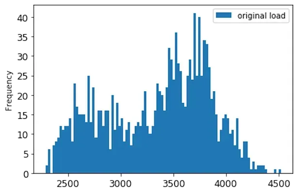
原始数据
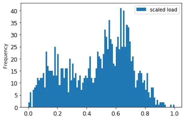
缩放后的数据
-
现在你已经校准了缩放后的数据,你可以缩放测试数据:
test['load'] = scaler.transform(test) test.head()
实现ARIMA
现在是实现ARIMA的时候了!你将使用之前安装的statsmodels库。
现在你需要遵循几个步骤
- 通过调用
SARIMAX()`` and passing in the model parameters: p, d, and q parameters, and P, D, and Q parameters. 2. Prepare the model for the training data by calling the fit() function. 3. Make predictions calling theforecast()function and specifying the number of steps (thehorizon`) to forecast.
What are all these parameters for? In an ARIMA model there are 3 parameters that are used to help model the major aspects of a time series: seasonality, trend, and noise. These parameters are:
p: the parameter associated with the auto-regressive aspect of the model, which incorporates past values.d: the parameter associated with the integrated part of the model, which affects the amount of differencing ( remember differencing ?) to apply to a time series.q: the parameter associated with the moving-average part of the model.
Note: If your data has a seasonal aspect - which this one does - , we use a seasonal ARIMA model (SARIMA). In that case you need to use another set of parameters:
P,D, andQwhich describe the same associations asp,d, and `q,但对应于模型的季节性部分。
-
首先设置你偏好的时间步长值。我们尝试3小时:
# Specify the number of steps to forecast ahead HORIZON = 3 print('Forecasting horizon:', HORIZON, 'hours')对于ARIMA模型参数的最佳值选择可能会很具有挑战性,因为它在某种程度上是主观的并且耗时。你可以考虑使用
auto_arima()function from the [pyramid库,该库可以帮助自动选择最佳参数。 -
现在尝试一些手动选择来找到一个好的模型。
order = (4, 1, 0) seasonal_order = (1, 1, 0, 24) model = SARIMAX(endog=train, order=order, seasonal_order=seasonal_order) results = model.fit() print(results.summary())打印出结果表。
你已经构建了第一个模型!现在我们需要找到一种方法来评估它。
评估你的模型
要评估你的模型,你可以执行所谓的向前滚动验证。实际上,时间序列模型每次有新数据可用时都会重新训练。这使得模型能够在每个时间步骤上做出最佳预测。
使用这种技术,从时间序列的开始处训练模型。然后在下一个时间步骤上进行预测。预测将与已知值进行评估。训练集将扩展以包括已知值,然后重复该过程。
注意:为了更有效地训练,你应该保持训练集窗口固定,这样每次向训练集添加一个新的观测值时,都要移除集合开头的观测值。
这种方法提供了对模型实际表现的更稳健估计。然而,它计算成本较高,因为它创建了许多模型。如果数据量小或模型简单,这是可以接受的,但在大规模情况下可能会成为一个问题。
向前滚动验证是时间序列模型评估的黄金标准,并且在你的项目中是推荐的做法。
-
首先为每个HORIZON步骤创建一个测试数据点。
test_shifted = test.copy() for t in range(1, HORIZON+1): test_shifted['load+'+str(t)] = test_shifted['load'].shift(-t, freq='H') test_shifted = test_shifted.dropna(how='any') test_shifted.head(5)load load+1 load+2 2014-12-30 00:00:00 0.33 0.29 0.27 2014-12-30 01:00:00 0.29 0.27 0.27 2014-12-30 02:00:00 0.27 0.27 0.30 2014-12-30 03:00:00 0.27 0.30 0.41 2014-12-30 04:00:00 0.30 0.41 0.57 数据根据其时间步长水平移动。
-
使用滑动窗口方法在一个循环中对测试数据进行预测,循环长度为测试数据的长度:
%%time training_window = 720 # dedicate 30 days (720 hours) for training train_ts = train['load'] test_ts = test_shifted history = [x for x in train_ts] history = history[(-training_window):] predictions = list() order = (2, 1, 0) seasonal_order = (1, 1, 0, 24) for t in range(test_ts.shape[0]): model = SARIMAX(endog=history, order=order, seasonal_order=seasonal_order) model_fit = model.fit() yhat = model_fit.forecast(steps = HORIZON) predictions.append(yhat) obs = list(test_ts.iloc[t]) # move the training window history.append(obs[0]) history.pop(0) print(test_ts.index[t]) print(t+1, ': predicted =', yhat, 'expected =', obs)你可以看到训练正在进行:
2014-12-30 00:00:00 1 : predicted = [0.32 0.29 0.28] expected = [0.32945389435989236, 0.2900626678603402, 0.2739480752014323] 2014-12-30 01:00:00 2 : predicted = [0.3 0.29 0.3 ] expected = [0.2900626678603402, 0.2739480752014323, 0.26812891674127126] 2014-12-30 02:00:00 3 : predicted = [0.27 0.28 0.32] expected = [0.2739480752014323, 0.26812891674127126, 0.3025962399283795] -
将预测结果与实际负载进行比较:
eval_df = pd.DataFrame(predictions, columns=['t+'+str(t) for t in range(1, HORIZON+1)]) eval_df['timestamp'] = test.index[0:len(test.index)-HORIZON+1] eval_df = pd.melt(eval_df, id_vars='timestamp', value_name='prediction', var_name='h') eval_df['actual'] = np.array(np.transpose(test_ts)).ravel() eval_df[['prediction', 'actual']] = scaler.inverse_transform(eval_df[['prediction', 'actual']]) eval_df.head()输出
timestamp h prediction actual 0 2014-12-30 00:00:00 t+1 3,008.74 3,023.00 1 2014-12-30 01:00:00 t+1 2,955.53 2,935.00 2 2014-12-30 02:00:00 t+1 2,900.17 2,899.00 3 2014-12-30 03:00:00 t+1 2,917.69 2,886.00 4 2014-12-30 04:00:00 t+1 2,946.99 2,963.00 观察每小时数据的预测,与实际负载相比。准确度如何?
检查模型准确性
通过测试其所有预测的平均绝对百分比误差 (MAPE) 来检查模型的准确性。
** 显示公式**
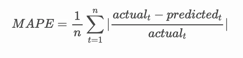
MAPE 是一种用比率表示预测准确性的方法,由上述公式定义。实际t 和预测t之间的差值除以实际t。"绝对值在计算中被累加,然后除以拟合点的数量n。"维基百科
-
将公式表达为代码:
if(HORIZON > 1): eval_df['APE'] = (eval_df['prediction'] - eval_df['actual']).abs() / eval_df['actual'] print(eval_df.groupby('h')['APE'].mean()) -
计算一步预测的MAPE:
print('One step forecast MAPE: ', (mape(eval_df[eval_df['h'] == 't+1']['prediction'], eval_df[eval_df['h'] == 't+1']['actual']))*100, '%')一步预测的MAPE:0.5570581332313952%
-
打印多步预测的MAPE:
print('Multi-step forecast MAPE: ', mape(eval_df['prediction'], eval_df['actual'])*100, '%')Multi-step forecast MAPE: 1.1460048657704118 %最好的结果是一个低数值:考虑到一个MAPE为10的预测意味着误差为10%。
-
但是,正如总是那样,更容易通过视觉方式看到这种准确度测量,因此让我们绘制一下:
if(HORIZON == 1): ## Plotting single step forecast eval_df.plot(x='timestamp', y=['actual', 'prediction'], style=['r', 'b'], figsize=(15, 8)) else: ## Plotting multi step forecast plot_df = eval_df[(eval_df.h=='t+1')][['timestamp', 'actual']] for t in range(1, HORIZON+1): plot_df['t+'+str(t)] = eval_df[(eval_df.h=='t+'+str(t))]['prediction'].values fig = plt.figure(figsize=(15, 8)) ax = plt.plot(plot_df['timestamp'], plot_df['actual'], color='red', linewidth=4.0) ax = fig.add_subplot(111) for t in range(1, HORIZON+1): x = plot_df['timestamp'][(t-1):] y = plot_df['t+'+str(t)][0:len(x)] ax.plot(x, y, color='blue', linewidth=4*math.pow(.9,t), alpha=math.pow(0.8,t)) ax.legend(loc='best') plt.xlabel('timestamp', fontsize=12) plt.ylabel('load', fontsize=12) plt.show()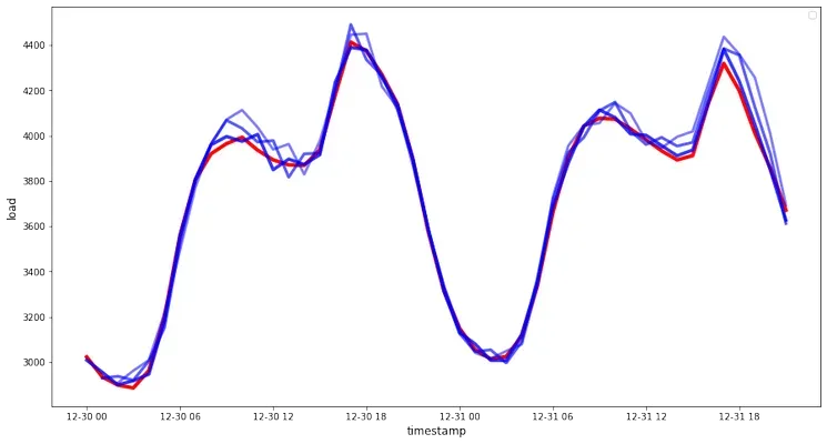
一个非常漂亮的图表,展示了具有良好准确性的模型。干得好!
挑战
深入研究测试时间序列模型准确性的方法。我们在这一课中提到了MAPE,但还有其他方法可以使用吗?研究它们并加以注释。一个有帮助的文档可以在这里找到:这里
课后测验
复习与自学
这节课只介绍了ARIMA时间序列预测的基础知识。花些时间深入了解这个仓库及其各种模型类型,学习其他构建时间序列模型的方法。
作业
声明:
本文件灏天文库团队进行了翻译。尽管我们力求准确,但请注意,翻译可能包含错误或不准确之处。原文档以其原始语言为准。我们不对因使用此翻译而产生的任何误解或误译负责。