CSS自定义属性与主题定制:让动画适应你的品牌风格
CSS自定义属性与主题定制:让动画适应你的品牌风格
Animate.css v4 的 CSS 变量体系
Animate.css v4 引入了一组 CSS 自定义属性(Custom Properties),作为动画参数的默认值。你可以在任何选择器上覆盖这些变量来定制动画行为。
/* Animate.css 内部定义的默认值(简化版) */ :root { --animate-duration: 1s; --animate-delay: 0s; --animate-repeat: 1; --animate-timing: ease; }
基础类 animate__animated 引用这些变量:
.animate__animated { animation-duration: 1s; animation-duration: var(--animate-duration, 1s); animation-delay: var(--animate-delay, 0s); animation-iteration-count: var(--animate-repeat, 1); animation-timing-function: var(--animate-timing, ease); animation-fill-mode: both; }
var(--animate-duration, 1s) 中的 1s 是回退值——如果 CSS 变量未定义,使用 1s。
在全局层面覆盖变量
最常见的用法是在 :root 上设置自定义值,让整个项目的动画风格统一:
:root { /* 全局加速 20% */ --animate-duration: 0.8s; /* 默认缓动改为先快后慢 */ --animate-timing: cubic-bezier(0.25, 0.46, 0.45, 0.94); }
这行代码会影响所有使用 animate__animated 的元素。如果某个元素需要不同的时长,可以单独覆盖:
.hero-section { --animate-duration: 2s; } .card-entrance { --animate-duration: 0.6s; }
CSS 自定义属性的继承机制让这种覆盖变得简单——子元素自动继承父元素的变量值,除非自己声明了同名变量。
组件级别的定制
在现代前端组件中,CSS 变量通常定义在组件根元素上:
<template> <div class="notification animate__animated animate__fadeInRight" :style="cssVars"> {{ message }} </div> </template> <script> export default { props: { speed: { type: String, default: 'normal' }, direction: { type: String, default: 'right' } }, computed: { cssVars() { const durations = { slow: '3s', normal: '1s', fast: '0.5s' }; return { '--animate-duration': durations[this.speed] }; } } } </script>
这样,同一个组件在不同场景下可以有不同的动画速度,而不需要创建多个 CSS 类。
与 Design Token 的结合
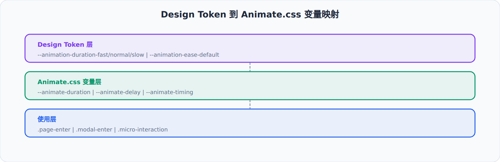
设计系统(Design System)通常用 Design Token 定义全局变量。Animate.css 的 CSS 变量可以自然地融入 Design Token 体系:
/* design-tokens.css */ :root { /* 基础色 */ --color-primary: #4361ee; --color-bg: #f8f9fa; /* 动画 Token */ --animation-duration-fast: 0.3s; --animation-duration-normal: 0.6s; --animation-duration-slow: 1.2s; --animation-ease-default: cubic-bezier(0.4, 0, 0.2, 1); --animation-ease-decelerate: cubic-bezier(0, 0, 0.2, 1); --animation-ease-accelerate: cubic-bezier(0.4, 0, 1, 1); } /* 映射 Design Token 到 Animate.css 变量 */ :root { --animate-duration: var(--animation-duration-normal); --animate-timing: var(--animation-ease-default); } /* 按场景使用不同速度 */ .page-enter { --animate-duration: var(--animation-duration-normal); } .micro-interaction { --animate-duration: var(--animation-duration-fast); } .modal-enter { --animate-duration: var(--animation-duration-slow); }
这种映射让你的动画参数与其他 Design Token 保持在同一体系内,设计师调整全局动画节奏时只需要改 Token 值。
常用的缓动函数
缓动函数(timing function)对动画的"手感"影响巨大。ease 是默认值,但不是所有场景都适合。
线性(linear):匀速运动,适合进度条、旋转加载指示器。
.linear-progress { --animate-timing: linear; }
Material Design 标准缓动:Google 提出的一组缓动曲线,分为减速、加速、标准三种。
/* 减速(Decelerate):元素进入视口 */ .entering { --animate-timing: cubic-bezier(0, 0, 0.2, 1); } /* 加速(Accelerate):元素离开视口 */ .exiting { --animate-timing: cubic-bezier(0.4, 0, 1, 1); } /* 标准(Standard):通用场景 */ .standard { --animate-timing: cubic-bezier(0.4, 0, 0.2, 1); }
弹簧效果(Spring-like):通过特殊的 cubic-bezier 值模拟弹簧。
/* 过冲弹簧 */ .spring { --animate-timing: cubic-bezier(0.175, 0.885, 0.32, 1.275); }
1.275 是终点的 y 值超过 1.0,表示动画在结束时"超过"了目标值,产生回弹感。Animate.css 的 Bounce 系列动画在关键帧层面实现了类似效果,但对于简单的进入/退出动画,用 CSS 变量修改缓动函数是更轻量的方式。
工具类与 CSS 变量的优先级
Animate.css 的工具类(animate__slow、animate__fast 等)内部也引用了 CSS 变量:
.animate__slow { animation-duration: 2s; animation-duration: calc(var(--animate-duration) * 2); }
这意味着:
- 如果
--animate-duration是默认值1s,animate__slow= 2s - 如果你已经覆盖
--animate-duration: 0.5s,animate__slow= 1s(0.5 * 2) - CSS 变量和工具类可以叠加使用,工具类基于 CSS 变量的值做倍数运算
优先级顺序(从低到高):
:root上的 CSS 变量默认值.animate__slow等工具类- 组件/元素级别的 CSS 变量覆盖
- 内联
style属性
暗色模式下的动画调整
CSS 变量还能响应媒体查询,让动画在不同环境下自动调整:
:root { --animate-duration: 1s; --animate-timing: ease; } @media (prefers-color-scheme: dark) { :root { /* 暗色模式下动画更快,减少视觉停留 */ --animate-duration: 0.6s; } } @media (prefers-reduced-motion: reduce) { :root { --animate-duration: 0.01s; } }
prefers-color-scheme 让暗色模式的动画节奏与整体视觉风格协调——暗色界面通常更"利落",动画也应该更快。prefers-reduced-motion 则为有运动敏感倾向的用户提供无障碍支持。
实战:品牌化动画主题
假设你的品牌需要"柔和、优雅"的动画风格,与 Animate.css 默认的 1s/ease 不同。通过 CSS 变量,你可以在不改源码的情况下调整整体风格:
/* 品牌:优雅柔和 */ :root { --animate-duration: 1.4s; --animate-timing: cubic-bezier(0.25, 0.1, 0.25, 1.0); } /* 品牌:科技利落 */ :root.tech-brand { --animate-duration: 0.5s; --animate-timing: cubic-bezier(0.25, 0.46, 0.45, 0.94); } /* 品牌:活泼有趣 */ :root.fun-brand { --animate-duration: 0.8s; --animate-timing: cubic-bezier(0.175, 0.885, 0.32, 1.275); }
三种品牌主题,三种动画风格,Animate.css 源码完全不用改。这就是 CSS 变量带来的"运行时主题切换"能力——不仅是颜色,连动画的节奏、弹性都可以根据品牌动态调整。