CSS滚动驱动动画:Scroll-drivenAnimations对Animate.css的影响
CSS滚动驱动动画:Scroll-driven Animations对Animate.css的影响
什么是 Scroll-driven Animations
Scroll-driven Animations 是 CSS 的新特性(2023-2024 年主流浏览器逐步支持),允许 CSS 动画直接由滚动位置驱动,不需要 JavaScript。
/* 传统方式:JS + IntersectionObserver */ .element { opacity: 0; transform: translateY(30px); transition: all 0.6s ease-out; } .element.visible { opacity: 1; transform: translateY(0); } /* 新方式:纯 CSS 滚动驱动 */ @keyframes fadeInUp { from { opacity: 0; transform: translateY(30px); } to { opacity: 1; transform: translateY(0); } } .element { animation: fadeInUp linear both; animation-timeline: view(); animation-range: entry 0% entry 100%; }
animation-timeline: view() 告诉浏览器"这个动画的时间线由元素在视口中的可见性驱动"。animation-range 控制动画的起止点。当元素进入视口时动画开始,离开视口时动画结束——全部由 CSS 控制,零 JavaScript。
当前浏览器支持情况
截至 2024 年中,Scroll-driven Animations 的支持情况:
| 浏览器 | 支持状态 | 版本 |
|---|---|---|
| Chrome | ✅ 支持 | 115+ |
| Edge | ✅ 支持 | 115+ |
| Firefox | ✅ 支持 | 115+ |
| Safari | ❌ 实验性 | 17+ (需开启 flag) |
| iOS Safari | ❌ 不支持 | - |
| Android Chrome | ✅ 支持 | 115+ |
桌面端覆盖较好,移动端 iOS Safari 仍不支持。生产环境需要 polyfill 或渐进降级。
对 Animate.css 的影响
冲突点
Scroll-driven Animations 与 Animate.css 的使用模式有本质差异:
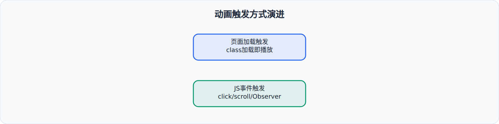
- Animate.css:动画在"添加类名"时开始,播放固定时长(如 1s),播放一次结束。
- Scroll-driven:动画在"滚动位置变化"时开始,跟随滚动进度持续更新,没有固定时长。
这意味着 Animate.css 的 animation-duration、animation-delay 等属性在滚动驱动场景下意义不同。
互补关系
两者更多是互补而非替代:
- Animate.css 处理一次性动画:页面加载时的进入效果、点击触发的反馈动画。
- Scroll-driven 处理持续动画:长页面中的视差效果、进度指示器、内容区域随滚动渐显。
一个实际的混合方案:
<style> /* Animate.css:首屏进入动画(一次性) */ .hero-title { --animate-delay: 0.2s; } /* Scroll-driven:滚动区域的渐显(持续) */ @keyframes scrollReveal { from { opacity: 0; transform: translateY(40px); } to { opacity: 1; transform: translateY(0); } } .scroll-section { animation: scrollReveal linear both; animation-timeline: view(); animation-range: entry 10% entry 80%; } </style> <!-- 首屏:Animate.css --> <header> <h1 class="animate__animated animate__fadeInDown hero-title">标题</h1> </header> <!-- 下方:Scroll-driven --> <section class="scroll-section"> <p>滚动到这里时渐显</p> </section>
渐进降级策略
由于 iOS Safari 尚不支持 Scroll-driven Animations,需要提供 JS 回退方案:
/* 默认使用 Scroll-driven(现代浏览器) */ @supports (animation-timeline: view()) { .scroll-reveal { animation: fadeInUp linear both; animation-timeline: view(); animation-range: entry 0% entry 100%; } } /* 不支持时使用 IntersectionObserver 回退 */ @supports not (animation-timeline: view()) { .scroll-reveal { opacity: 0; transform: translateY(30px); transition: opacity 0.6s ease-out, transform 0.6s ease-out; } .scroll-reveal.visible { opacity: 1; transform: translateY(0); } }
// @supports 不支持的回退 JS if (!CSS.supports('animation-timeline', 'view()')) { var observer = new IntersectionObserver(function(entries) { entries.forEach(function(entry) { if (entry.isIntersecting) { entry.target.classList.add('visible'); } }); }, { threshold: 0.1 }); document.querySelectorAll('.scroll-reveal').forEach(function(el) { observer.observe(el); }); }
Animate.css 未来可能的方向
Animate.css 社区已经有人提议为库添加 Scroll-driven 模式。可能的 API 设计:
/* 假设的 Animate.css Scroll-driven 模式 */ .animate__animated.animate__fadeInUp.animate__scroll-driven { animation-timeline: view(); animation-range: entry 0% entry 100%; }
添加一个 .animate__scroll-driven 类就能把任何 Animate.css 动画转为滚动驱动模式。这是一个很自然的扩展方向。
一个滚动进度条案例
把 animation-timeline: scroll() 用在页面根滚动容器上,可以做出跟随滚动位置的顶部进度条,这是 Scroll-driven Animations 最直观的应用之一:
@keyframes growProgress { from { transform: scaleX(0); } to { transform: scaleX(1); } } .progress-bar { position: fixed; top: 0; left: 0; right: 0; height: 4px; background: #4f46e5; transform-origin: left center; animation: growProgress linear both; animation-timeline: scroll(root); }
scroll(root) 表示时间线绑定到页面根容器的滚动过程,进度条在页面从顶部滚到底部的过程中从 0 长到 100%。相比传统做法里每个滚动帧都要用 requestAnimationFrame 计算 scrollTop 与 scrollHeight 的比值,这段代码只有几行 CSS,而且合成器可以独立更新进度,不会触发布局抖动。
同样的思路也可以用在"文章目录高亮""侧边卡片吸附提示"上。需要注意 scroll(root) 的进度是按整个滚动范围线性映射的;如果只想绑定某个局部容器,把 root 换成该容器的选择器即可。配合 animation-range 还能只取滚动过程的一段,比如"元素从出现到离开视口的中间 40%"。
实际建议
- 目前不要在生产环境依赖 Scroll-driven Animations 作为唯一方案。iOS Safari 的覆盖率太低。
- 用
@supports做渐进增强。支持 Scroll-driven 的浏览器享受零 JS 的流畅体验,不支持的用 IntersectionObserver 回退。 - Animate.css 的定位不会变。即使 Scroll-driven 全面普及,Animate.css 仍然负责"一次性的入场/退出/强调"动画。滚动驱动是新场景的补充,不是替代。
- 关注 Animate.css 的更新。如果社区推出了 Scroll-driven 扩展,可以评估是否升级。